Tuesday, 10 April 2012

Film Noir: Poster Ideas

POSTER IDEAS:

This poster reminds me of the type you see outside cinemas promoting films - all the actors are clearly visible, and as the audience won't have time to stop and look, the title and the actors are all that is necessary for them to see.

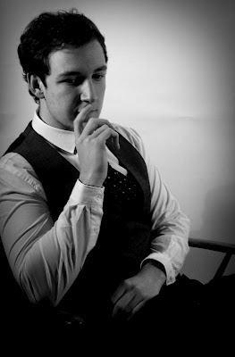
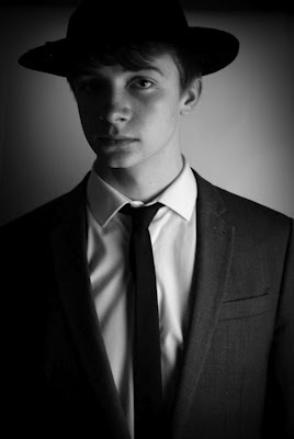
The central femme fatale to our story is of course central in the poster, and the two men who she manipulates are either side of her. I made the poster black and white, and also a photo frame 'division' in between the middle picture and the outer ones to make it look a littlemore old fashioned, because of course our film is set in the 1950's. All of the actors are in smart clothes, which to the immediate eye initiates money. The whole poster seems rather 'wealthy' and the left two characters look like they earn money in perhaps more ways than the law permits. (Bobby and Bonnie). On the other hand, our character Carter in direct comparison to the intricate details of Bobby's tie and waistcoat and Bonnie's hat and scarf looks incredibly plain in just his hat - suggests he does not earn or deal with as much money as the other two do.

The red of the title is again a feature which stands out against the black - the exact reason why I chose to use the black and white background and the red coloring of the letters. The middle positioning over the only female on the poster allows the audience to see that she may well be the cause of the 'lust' within the story. Centering her also appeals to the male gaze. (Laura Mulvey's Theory)

I wanted to keep this poster fairly simple - more modern audiences will appreciate this, due to the simplicity of posters such as these:


Both these posters conmbined are like my poster - both very simple, to the point, and you can
see the connection between the characters just by the way they are portrayed in the photographs, as well as the traits the characters possess.


This poster is a lot more suggestive than the other one - even though the same image for the femme fatale is used, because it is made the main photograph we know that her character is perhaps more important - and perhaps in more control than the two men down the bottom. Her position at the top of the poster taking up over half suggests she is 'above' them in power. Her character's belittling of the men is reflected by the poster as they are both shown as very 'small' men in comparison to her. By putting the important line from the script into verse at the top like I did on the other poster it suggests that she is indeed very seductive in the story line.

I've placed the title in the centre of the poster, carefully so that the word 'lustful' is attractive enough to the eye because of it's red color. It is the only red on the page and therefore makes it stand out further. The photographs of the characters are in black and white, but I added a cartoon effect to echo the poster of 'Glinda' because none of the other posters I had done had a different effect to them.

The two men have close-ups and when this is shown against Bonnie it develops almost a distance between her and the audience. The fact that all the characters are making eye contact by looking directly at the camera allows the audience to feel like they could relate to each - however Bonnie's gesture of seductive silence with her finger over her lips contradicts this for her character and the clearer images of the men making eye contact suggests she uses them - especially through the questioning looks they are both giving.
I like the way that the grey colour and the hints of white connect to the colour of the text.
I wanted to put the names of the characters on this one because it fits in nicely, and I felt that it would make it look much more like a film poster.

Similar modern posters I looked at to generate this layout idea were these:


This poster had the division across it to show the connection between the two couples, and instead of confusing onlookers by putting all the characters together, the division allows us to see that somewhere in the story these two couples join together. Similarly to this I have put Bonnie fully across the whole poster, and then divided the two men's images up smaller. This means that both of them are equally connected to her, and also the fact that they are set next to each other puts them together. I did not want to take photographs of Carter and Bonnie together and use that like the love affair is shown in this poster because Bobby supposedly has some kind of link to Bonnie too, and Bonnie and Carter do not end up together - it would be misleading.
I used varying sized text in my title too - 'Lustful' is smaller than injustice so that the 'lust' part of the storyline is shown to be overshadowed by the 'injustice' part, reflected through the poster.


In his poster I like the way each of the characters are posed to initiate how they behave in the story. It's not all together obvious but they each have a different look on their face. I used this in mine by putting rather unhappy or perhaps 'expressionless' images pf the two men at the bottom to show that as men they would hide their emotions, but at the same time something is wrong because they are not happy. Of course as the male characters (one being the main protagonist) the depressing time the story is set in is reflected in the way they both appear to feel on the poster.) Bonnie's posture and suggestive behaviour in her image is much like the bottom left photograph of the man - we see what she does or might go through in the film from the way she is portrayed on the poster.

Sunday, 1 April 2012

Film Noir: Film Audience


To make sure we have aimed our film at the target audience of 12+ (12A) we had to have a variety of things to fit into that category.
12A is defined as:
(Found on the website: http://www.bbfc.co.uk/classification/guidelines/12a12/)


" No one younger than 12 may see a ‘12A’ film in a cinema unless accompanied by an adult, (over 18)."
We are not responsible for the people who attend our film showings if we are not present, it is down to the cinema or parental guidance.


Discrimination
"Discriminatory language or behaviour must not be endorsed by the work as a whole. Aggressive discriminatory language or behaviour is unlikely to be acceptable unless clearly condemned."
 Our Film:
We have no racism or anything of the kind throughout our film. The only aggression within the film is at the end when there is the gun fight and Carter hits Bobby twice, but neither of these show gory content or indeed have content which would be deemed horrid for the viewers. It is quite tame violence.


Drugs
"Any misuse of drugs must be infrequent and should not be glamorised or give instructional detail."
Our Film: 
During the film the femme fatale is supposedly participating in the drug heist with Bobby but actually we find out at the end that she has in fact avoided the drug side of things and simply dealt with the money, making it clear that drugs are best avoided. Nothing in the story glamorises the use of drugs or indeed has any images of it - no use of drugs takes place in the story.


Horror
"Moderate physical and psychological threat may be permitted, provided disturbing sequences are not frequent or sustained."
Our Film: 
The only physical threat there is in the film is again the violence between Bobby and Carter at the end. The sequence is not particularly disturbing due to any horrid images or so forth, and there is only one sequence that contains violence, so it is not frequent or sustained in the duration of the film.


Imitable Behaviour
"Dangerous behaviour (for example, hanging, suicide and self-harming) should not dwell on detail which could be copied, or appear pain or harm free.  Easily accessible weapons should not be glamorised."
Our Film:
No hanging, suicide or self harming is present in the film - all the characters have great confidence which could pose as a positive aspect to the film in relation to the kinds of behaviour mentioned there. The weapons used in the film end in disaster - both the men having guns is not something that ends well - it is certainly not glamorised as Carter says "get him to the hospital" and undoubtedly will end up in trouble - the consequences for his actions will be present. 


Language
"Moderate language is allowed. The use of strong language must be infrequent."
Our Film: 
We only use one swear word in the whole of our film and it is not one regarded by British film association to be one that must be only used once. This category is filled well because we did not rely on swear words to enhance the adulthood of the characters or indeed their frustration at their situations.


Nudity
"Nudity is allowed, but in a sexual context must be brief and discreet."
Our Film:
There is no nudity in our film.


Sex
"Sexual activity may be briefly and discreetly portrayed. Sex references should not go beyond what is suitable for young teenagers. Frequent crude references are unlikely to be acceptable."
Our Film:
There is no sex whatsoever in our film.


Themes
"Mature themes are acceptable, but their treatment must be suitable for young teenagers."
Our Film:
The theme of the film is quite mature, but the way it is handled means that no horrendous harm or indeed unpleasant happenings reflect the theme. As the story is to do with a Detective who falls in love with someone who wants money, it could be quite a dangerous one to have for young teenagers, but actually because it is gently portrayed I think the theme is suitable for young teenagers.


Violence
"Moderate violence is allowed but should not dwell on detail. There should be no emphasis on injuries or blood, but occasional gory moments may be permitted if justified by the context. Sexual violence may only be implied or briefly and discreetly indicated, and must have a strong contextual justification."
Our Film:
No gore is present in our film. Pain inflicted from a gunshot is only depicted by a groan, and the slaps Carter gives Bobby can barely be seen, so it is only moderate violence and therefore works fine. 
No sexual violent is in our film.


Audience Feedback:


After posting our film on youtube and FaceBook we were able to get feedback for it, and also constructive criticism. We showed our film to our class too and were able to gain suggestions for improvement then also. I asked my family to view it too!


You Tube:
"Like the idea, with a better camera and some more interesting/creative camera angles this could be super pro" I think this is a really good point! I think we could have looked at some more modern films instead of basing our whole film on old fashioned film noirs to capture the audiences of today. I know that our film is fairly basic in it's use of camera angles and variety of shots and so despite wanting to make an authentic film perhaps we could have done more to persuade today's technologically advanced audiences!


Family:
"The girls aren't as easily heard as the boys" Naturally girls have quieter voices normally but this is no excuse! We must make sure on future filming that the girls are as equally clear as the boys, because their voices shouldn't distinguish from each others in terms of sound, unless relating to the type of character they belong to.
"Brilliant" was said which was really nice.
"I like the way the girl looks - she is very pretty and has just the right look for the kind of character she plays" This was a really good comment because it shows that we have thought through our femme fatale successfully! 


FaceBook:
"Really good" 
"Jumpy sometimes but really good story" The storyline took us a while to work out so it's good that people have enjoyed it's twists! Unfortunately jumpy has come up a lot. We could have definitely improved the quality of our film by making it a lot smoother in transitions and in between the varying shots we used within scenes. One scene in particular that this stands out for is the office scene. Between the differing shots of Bonnie the transitions are quite jumpy, and don't work to please the eye. The end part where Carter is leaning away from Bonnie is also uneven and doesn't run smoothly - the audiences all thought the editing needed to be sharper.

Class Show:
"Music too loud in gunshot scene" We knew this might come up! Unfortunately as I have said before the music on the macs was not as loud as when we transferred the footage onto another computer.
"Voices too quiet outside front door" Again this is in a scene that we felt was clear enough on the macs - we know for next time to double check this, or if we feel sceptical about the sound we should record a voiceover just to be on the safe side.


Thursday, 29 March 2012

Film Noir: Poster Progress


This is a rough poster idea. I like the combination of the colours black white and red - they work well together in my opinion! The black background of course reflects the darkness of the film, and the red shows the danger of our femme fatale. I will do variations of posters and choose the one I like the most to be my final.

I used our original logo at the top to create a recognition factor. I like the simplicity of the poster and the shots are almost criminal snapshots which allow the onlooker to see the action that might entail in the storyline. I used the line from the script that Detective Carter says when he talks about bonnie (scene 3) "She made me weaker than I'd ever imagined" but adapted it to address the audience, and therefore perhaps captivating them.

The 'lustful' word is the only red throughout the whole of the poster. This emphasizes the importance of Bonnie Kensington's role and the power she has. Red is the colour of passion, blood and danger and all of those things connect to the story. They are the semiotics of the colour as many people understand, so they will have the same trigger in their mind for the colour as I have intended them to by using the colour only on the one word.
I would like to make a poster that is a little more aesthetically pleasing and perhaps a little more modern. It would be good however to recreate one like I have seen for Double Indemnity, which highlights the twisted romance in the tale.

Tuesday, 27 March 2012

Film Noir: Poster Ideas

In addition to our films we must make a poster to go alongside it. The photos we have taken that could be used to go onto my poster are these:

I want to put Ellen as the main focus of the poster and then either just Ed or both Ed and Ben surrounding her in some way to show onlookers the main characters within the story. The poster needs to show the moral of the story but also appeal so that the film can draw more viewers from it.

Some inspirations of film noir posters include:


I have chosen the Black Dahlia poster because even though there is only half the woman's face visible, the black background makes her all the more the focus. I want our femme fatale to have this kind of instant effect, even though the two characters are very different in the individual films. The black and red theme that is carried throughout is also something I would like to take hold of, because our logo of 'Lustful Injustice' has a red and black theme. I like the simplicity of the poster.

In the poster for 'Gilda' I like the way the focus is also on the femme fatale. I think her obvious glamour and casual stance make her appear all the more dangerous. The colour choice in the poster is a lot less powerful due to the use of pastel purple and blue. The whole poster is fairly pale as a whole apart from obviously the black background, as well as the text being a peach colour. Only the word 'Gilda' was in red which I like - even though she is presented as a fairly innocent woman with the colour choice for her clothes, the red used on her name warns us about her character, because it's the only red used on the whole of the poster. I want this kind of effect on my poster for 'Lustful Injustice' too.

I put the Brick poster on here because of it's power and simplicity. The use of just a hand works really well because of it's position in the water and the apparent blood signifies a death. I could use perhaps an envelope, a suitcase or a gun if I wanted to create a similar effect in relation to our own film.

Some photos I may use from the ones we have are:


In this one Ellen looks slightly too innocent - it could be difficult to add in the other characters. However the little bits of red she has on her, like her lips and nail varnish could be key for suttle 'danger warnings' of her character to the audience.
The sepia tone to the image could make the poster look authentic, but because our film is in black and white this might not be a necessary effect. When looking at other posters, when the films are in black and white cartographic images are used with very attractive colour choices to pull in the audiences of the time, as colour television had not been invented.


The fact she is looking straight at the camera in this one could make this a very powerful photograph to use on my poster. I think that the two male characters can be almost transparent in this and her photograph kept opaque to make clear who is the key character. I would like to try this. I could keep the image portrait or rotate it 90 degrees left so that the focus in her eyes are even more noticeable and would therefore have more of an effect. The eyeliner on her top lids really bring out her eyes and definitely follows the style of other film noir posters and characters in them I have seen.

Another thing about this image I like is that it is an unusual pose and one you could suggest she is 'laying' next to someone, which is automatically seductive. In some images I have posted before on my blog of the kind of poses I wanted Ellen to do, there is one of a dark haired woman laying on a dark surface with a cigarette in hand, looking seductive. This is my own interpretation of that. Ellen does not smoke and did not want to even consider having one just to hold for a photograph which is fair enough. Smoking is now seen as not 'cool' so one of our modern twists on her character is that she does not smoke.


These photographs will both be very good to have transparently on top of any images of Ellen. Both this one and the one below show the males looking incredibly serious and of course in contrast with Ellen who looks either seductive or happy, it gives out the depressed nature of their characters against hers. Putting them all together on a poster will make sure the audience get the right idea about the story line, just through the images.


This photograph is similar to the poster of 'Gilda' at the top. The original image of this is in colour, so I could use the red colour to create the same kind of colourful array as the Gilda poster did. I like the sultry pose and her seriousness, however I'm not sure how much it would create the contrast between her and the two males I discussed previously if I use this one. She is central though and also looks very 'femme fatale' like so it could work really well. I'd like to try and use this photograph or one similar and also use the colour version to alert onlookers of her dangerous nature, due to the red dress.


Film Noir: Showing Our Films

To make us all feel like we had achieved something it was organised for all the groups to show each other their films and allow us all to give the appropriate feedback. We made sure our film was all ready for show but unfortunately after struggling with the importing of music onto our film clips we couldn't show it as we wanted it to be seen. Some cuts also needed sharpening up, so we will work towards achieving better editing before we can say we have completely finished our film and are happy with it.


Film Noir: Editing 2

We have completed putting the whole film into sequence and editing it together now. One of my favourite parts of the editing so far is the arration at the beginning, when Detective Carter is at his desk searching through the photographs. The soft minor tone in music underlying the strong, american narration in my opinion makes the perfect opening for our film. It's exactly how i'd
imagined it would be, and the rough edge in the voice makes it so much more inticing - it's as if we feel he is a troubled protagonist and it therefore draws us into the story. The mystery we want is created however by us not showing the character's face straight away, developing a secretive and suspenseful atmosphere.
The typical image of film noir is also quickly introduced because of the hat being immediately visible and the black/white use of colour.


We used the tool 'voiceover' in final cut on the Apple Macs we are using to edit and recorded our scripted words to overlay the beginning of our film. Ed did a fantastic job of it and sounded just like we wanted him to. He has a strong male voice and this definitely comes across well in the recording. It took a couple of recordings because of stumbles over words and correctly selecting it's positioning over clips so the timing was right, but really did work well.


During the outside part of the restaurant scene (scene 3) wind and cars is the priority sound in the clip. In order to make sure our actors were clearly understood and their words had the desired effect we needed to record the lines again using the voiceover tool due to the unwanted sounds on the camera. We made sure their lines synced in with the on screen words perfectly, and also that their voices were well pronounced. The scene most certainly works better now that the voiceover has been done.


The last voiceover we did was the one for the office scene. I knocked on the desk, Toby said
'Come In' and Ellen said 'Hello Sir' to fill in the part of the Office scene (scene 1) that when we played back during editing we felt weren't clear enough. It worked well and as it is only a small recording doesn't make too much difference to the rest of the clip but allows our audience to hear it much better.
Unfortunately the office scene was filmed in a tight time slot as we borrowed a teachers office, and the people around were loud and caused us a problem in the editing. Some of the script had to be cut out because of mistakes like sound errors, but after trying to cut it all together it ended up having to be quite jumpy, and unfortunately does not have the effect we desired. Some of the script has a great deal of power, such as the close up on Bonnie when she says 'a big problem' but learning from this, we must ensure to capture a lot more extra footage than we did this time.


We added a 'ripple' effect after the introductory scene and before the last scene where the detective says 'This isn't over' to make sure audiences could easily distinguish between the flashback and present tense within the story. Even though this isn't common in film noir films we felt it was necessary as the whole thing is in black and white and only words could otherwise help the understanding of the switch.

In the gun shooting scene we recorded gun shots sounds off the internet on Ellen's iphone and then played them back whilst recording on Final Cut Express to fit them into the sequence perfectly. The sounds aren't overwhelmingly loud but they sound powerful and of course we know by Bobby's reaction that he has been shot, no need to show actual gunshots.


In the above left photograph, Bobby can be seen saying the number '4' as part of the script, "5,4,3,2," but what we did was filmed the script twice from two different angles, and overlapped the line so that the sound works perfectly, and a better variety in the scene was created. It works really well I feel.

Thursday, 15 March 2012

FIlm Noir: Editing

We began editing last week and have so far achieved all but the last scene in putting the story together and editing it into one. We used the tool 'desaturate' to turn all the clips into black and white. I really like the way the scenes we have look in black and white because it definitely exaggerates the impression of 'film noir' and helps set the storyline.

Props that we used such as the hat personally I feel are so key in creating the right kind of interpretation of the film. I think it is definitely a positive thing that we stuck to more traditional realms of the genre instead of trying to create a modern version, because I have thoroughly enjoyed working in 1950's america!

During editing we have used long shots and panning shots for example to 'introduce' the scene instead of cutting straight to each one. At the beginning of the restaurant scene the camera pans up from Bonnie's red heels to the table where we see Carter opposite. This is a nice way to not only show that she is the more dominant one as she is technically introduced first, but also allows the audience to see a variety of shots and be eased into the scene. At the beginning of the scene where Carter goes to Bobby's house, we see him walk past the camera in the dark and create a shadow by the light of the front door. This iconic image looks very typical of the genre, especially with the hat! As the camera is quite low it means that we are introduced to Carter as he gets further away. We only see here the back of him, which accentuates the mysterious characteristic of main male protagonists.

We will have to use a recorded voice over over the ending of the restaurant scene because cars were going past, and we can't get the full effect of the words said so well by the actors. Lines such as 'how can I repay you' and 'Anything for you' are invaluable to the storyline and key for hooking audiences into the love story, so we want to make sure we get their full power into the scene.