I want to put Ellen as the main focus of the poster and then either just Ed or both Ed and Ben surrounding her in some way to show onlookers the main characters within the story. The poster needs to show the moral of the story but also appeal so that the film can draw more viewers from it.
Some inspirations of film noir posters include:


I have chosen the Black Dahlia poster because even though there is only half the woman's face visible, the black background makes her all the more the focus. I want our femme fatale to have this kind of instant effect, even though the two characters are very different in the individual films. The black and red theme that is carried throughout is also something I would like to take hold of, because our logo of 'Lustful Injustice' has a red and black theme. I like the simplicity of the poster.
In the poster for 'Gilda' I like the way the focus is also on the femme fatale. I think her obvious glamour and casual stance make her appear all the more dangerous. The colour choice in the poster is a lot less powerful due to the use of pastel purple and blue. The whole poster is fairly pale as a whole apart from obviously the black background, as well as the text being a peach colour. Only the word 'Gilda' was in red which I like - even though she is presented as a fairly innocent woman with the colour choice for her clothes, the red used on her name warns us about her character, because it's the only red used on the whole of the poster. I want this kind of effect on my poster for 'Lustful Injustice' too.
I put the Brick poster on here because of it's power and simplicity. The use of just a hand works really well because of it's position in the water and the apparent blood signifies a death. I could use perhaps an envelope, a suitcase or a gun if I wanted to create a similar effect in relation to our own film.
Some photos I may use from the ones we have are:

In this one Ellen looks slightly too innocent - it could be difficult to add in the other characters. However the little bits of red she has on her, like her lips and nail varnish could be key for suttle 'danger warnings' of her character to the audience.
The sepia tone to the image could make the poster look authentic, but because our film is in black and white this might not be a necessary effect. When looking at other posters, when the films are in black and white cartographic images are used with very attractive colour choices to pull in the audiences of the time, as colour television had not been invented.

The fact she is looking straight at the camera in this one could make this a very powerful photograph to use on my poster. I think that the two male characters can be almost transparent in this and her photograph kept opaque to make clear who is the key character. I would like to try this. I could keep the image portrait or rotate it 90 degrees left so that the focus in her eyes are even more noticeable and would therefore have more of an effect. The eyeliner on her top lids really bring out her eyes and definitely follows the style of other film noir posters and characters in them I have seen.
Another thing about this image I like is that it is an unusual pose and one you could suggest she is 'laying' next to someone, which is automatically seductive. In some images I have posted before on my blog of the kind of poses I wanted Ellen to do, there is one of a dark haired woman laying on a dark surface with a cigarette in hand, looking seductive. This is my own interpretation of that. Ellen does not smoke and did not want to even consider having one just to hold for a photograph which is fair enough. Smoking is now seen as not 'cool' so one of our modern twists on her character is that she does not smoke.
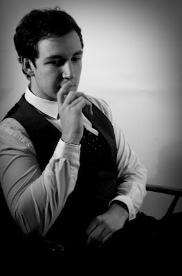

These photographs will both be very good to have transparently on top of any images of Ellen. Both this one and the one below show the males looking incredibly serious and of course in contrast with Ellen who looks either seductive or happy, it gives out the depressed nature of their characters against hers. Putting them all together on a poster will make sure the audience get the right idea about the story line, just through the images.

This photograph is similar to the poster of 'Gilda' at the top. The original image of this is in colour, so I could use the red colour to create the same kind of colourful array as the Gilda poster did. I like the sultry pose and her seriousness, however I'm not sure how much it would create the contrast between her and the two males I discussed previously if I use this one. She is central though and also looks very 'femme fatale' like so it could work really well. I'd like to try and use this photograph or one similar and also use the colour version to alert onlookers of her dangerous nature, due to the red dress.
No comments:
Post a Comment